Blog & Insights
Sharing my thoughts and experiences from my journey as a developer.
Table of Contents
Cultural Shifts: What Working at a Japanese Company Taught Me About Unexpected Differences in Web Development
When I started my first job at a Japanese company, I quickly realized that the digital design world I knew was a little different here. From terminology to tools, here are some of the most interesting things I noticed that stood out to me.
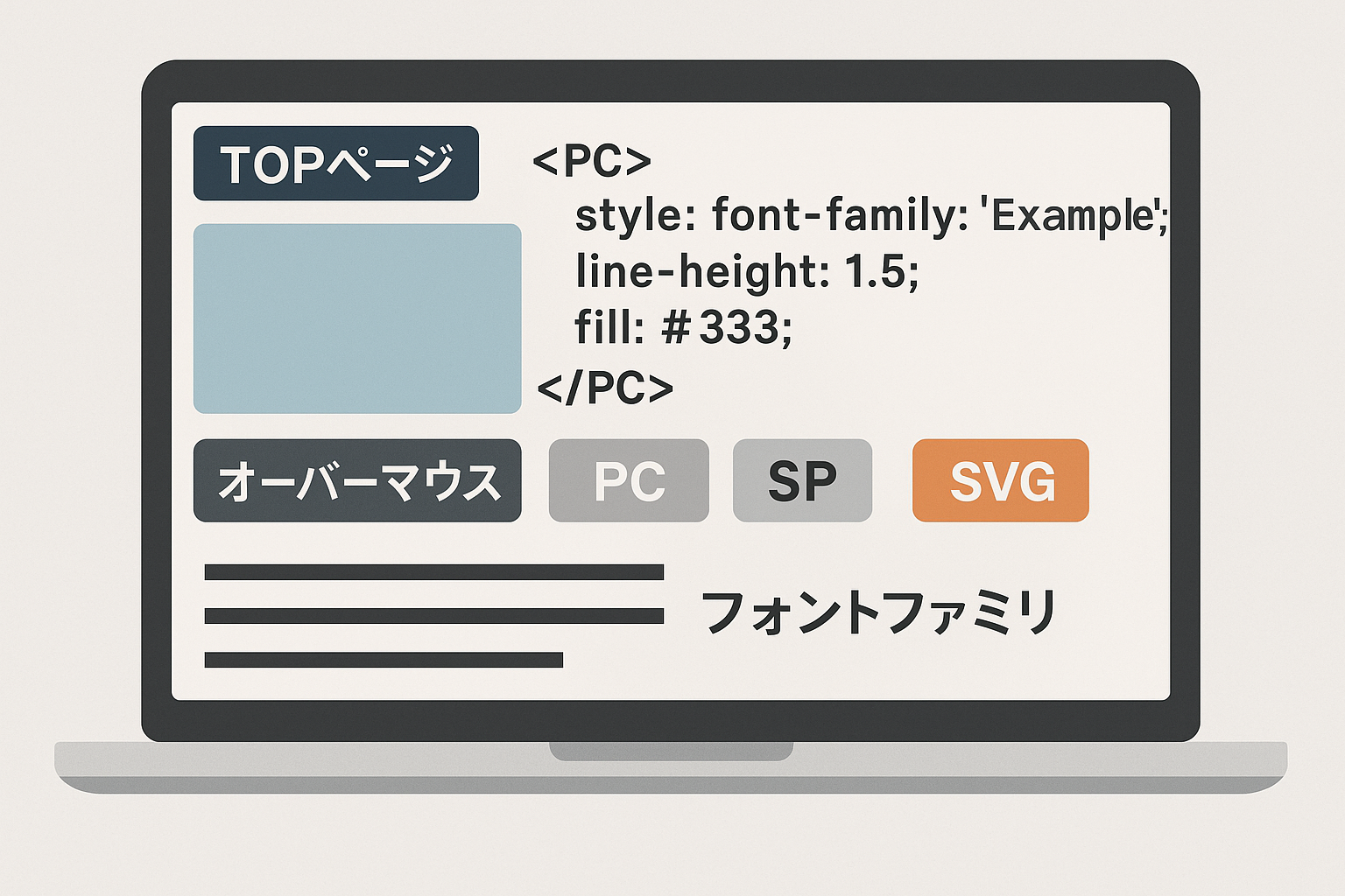
1. It's the "Top Page", Not the "Home Page"
In the West, the main landing page of a website is almost universally called the "Home" or "Landing" page. In Japan, however, I found that the term "トップページ " (toppu pēji), or "Top Page", is used more frequently. It's a small difference, but one that you'll see consistently in project documentation and discussions. It's a key linguistic nuance to be aware of if you're collaborating with Japanese teams.
2. SP and PC: A Different Device Paradigm
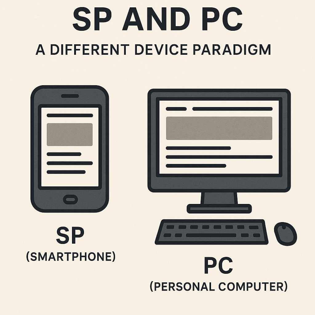
Forget about "mobile" and "web" or "desktop" views. In Japan, you'll hear SP (which stands for smartphone) and PC (personal computer) to distinguish between screen sizes. When a designer talks about the SP version of a website, they are referring to the mobile layout. This is a common and standard shorthand, so getting familiar with it will help you communicate more effectively.
3. The Art of Hover States: オーバーマウス Layers in Adobe Illustrator
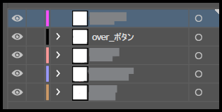
I was surprised to find that Adobe Illustrator, often seen as a tool for vector graphics and illustrations, was used for a lot of web and UI design. A particularly unique practice I observed was the use of オーバーマウス (ōbāmausu), or "over mouse", layers within Illustrator files. This layer would contain the hover state of a button or element, which designers would simply show or hide to demonstrate the interactive effect.
4. The Importance of Line Breaks
Line breaks are a crucial design detail, and in Japan, there's a heightened awareness of how they impact readability. You’ll often find specific instructions on whether a line should break on the SP or PC version. This is because the spacing and flow of Japanese characters can be significantly affected by screen width. A line break that looks good on a PC might be awkward and hard to read on a smartphone, so designers are very deliberate about where to place them.
5. Punctuation Spacing: The Devil in the Details
Japanese | Western | ||
|---|---|---|---|
「 」 | Hi 「Hello」Hi | [] | Hi [Hello] Hi |
( ) | Hi ( Hello)Hi | () | Hi (Hello) Hi |
The treatment of Japanese punctuation marks like 「 」 (Japanese quotation marks) and ( ) (Japanese parentheses) revealed another layer of cultural attention to detail. Unlike Western punctuation that generally works well with standard spacing algorithms, Japanese punctuation requires careful consideration of surrounding whitespace. I noticed that extra spaces beside these characters could create awkward visual gaps that disrupted the text's natural flow.
6. Font Family Inconsistencies and SVG Challenges
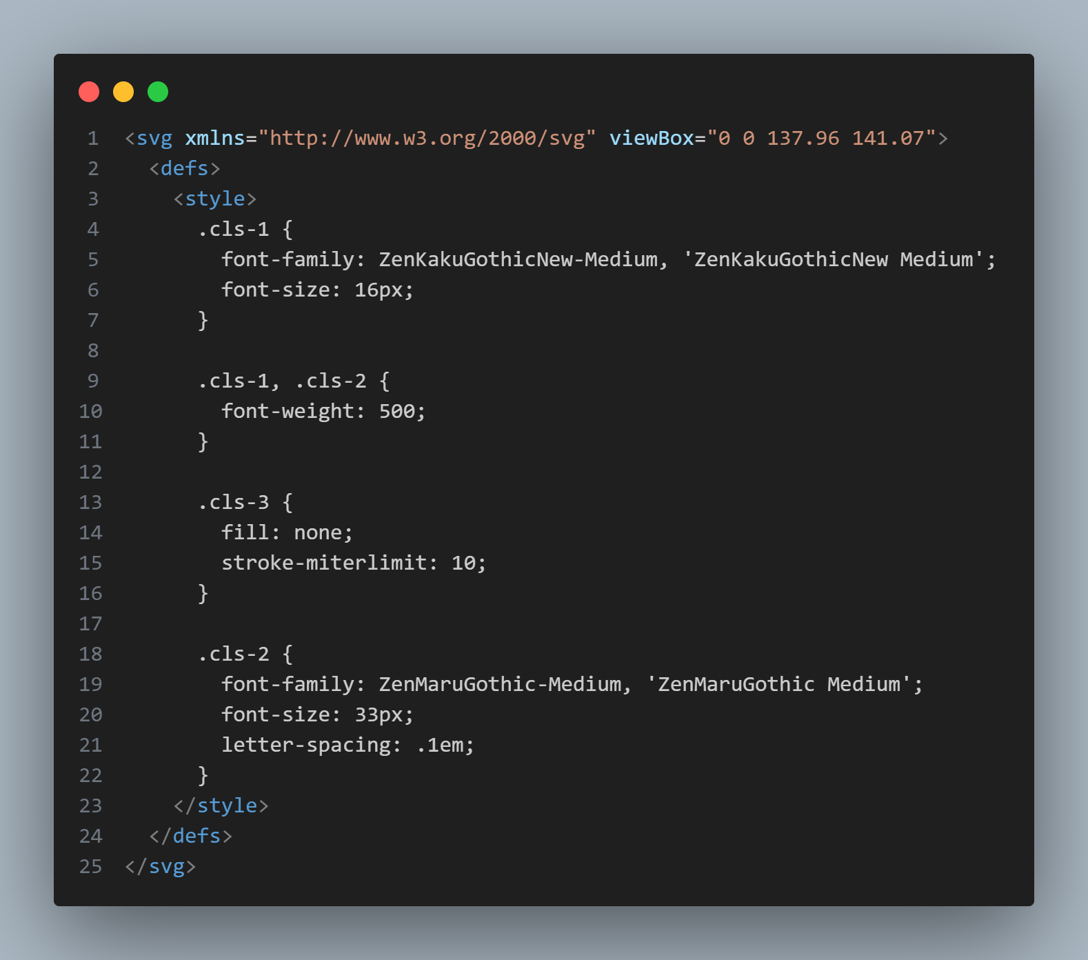
Some of the Illustrator‑exported SVGs came with inline CSS specifying font families that weren’t always available in our client browsers, leading to inconsistent typography across different user environments. This was especially problematic with SVG graphics that had font family specifications embedded in their CSS, creating a disconnect between intended design and actual user experience.
These experiences taught me that effective web development requires more than technical skills—it demands cultural sensitivity and attention to details that might seem insignificant from an outside perspective. The Japanese approach to web development emphasizes precision, hierarchy, and consideration for user experience in ways that reflect broader cultural values.
Working in this environment made me a more thoughtful developer, one who considers not just functionality and aesthetics, but also cultural context and user expectations. These insights have fundamentally changed how I approach international projects and cross-cultural digital experiences.